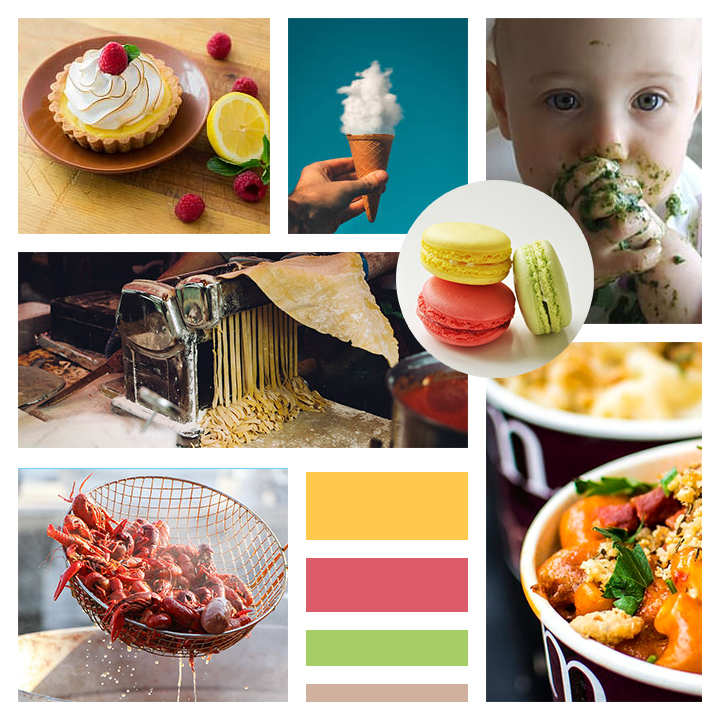
My mood board is for Bon Appetit, a food magazine. The magazine publishes recipes, cooking tips, food photography, food reviews and stories that celebrate the art of dining. Bon Appetit’s style is more curated and posh as compared to other contemporary food magazines, and it has a very rustic feel to it. It also has a YouTube channel and a large social media following.
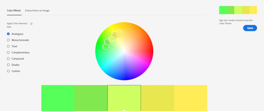
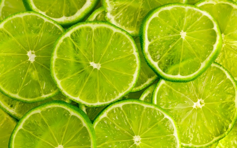
For my design, I wanted to capture the rustic essence of Bon Appetit while still ensuring that the colors were still bright, appetizing and reminiscent of food. I incorporated yellow, green and muted coral red in my palette as these colors are commonly associated with food. The pictures I chose were aesthetically pleasing and represented various types of food, from dessert to street food and pasta because Bon Appetit has a wide variety of food recipes they feature. I wanted to keep my mood board relatively simple to represent Bon Appetit’s more laid-back, simplistic, old-world charm. Circles are a running theme in my picture because I wanted to include circular food to give my design a sense of uniformity. Not only is the food in the shape of circles, it also represents an underline message to promote circular food initiative – a movement that wants to close the gap on organic waste by diminishing food wastage. The circles thus represent the message of food conservation and returning nutrients to the circular economy so that they can contribute to the next production cycle.