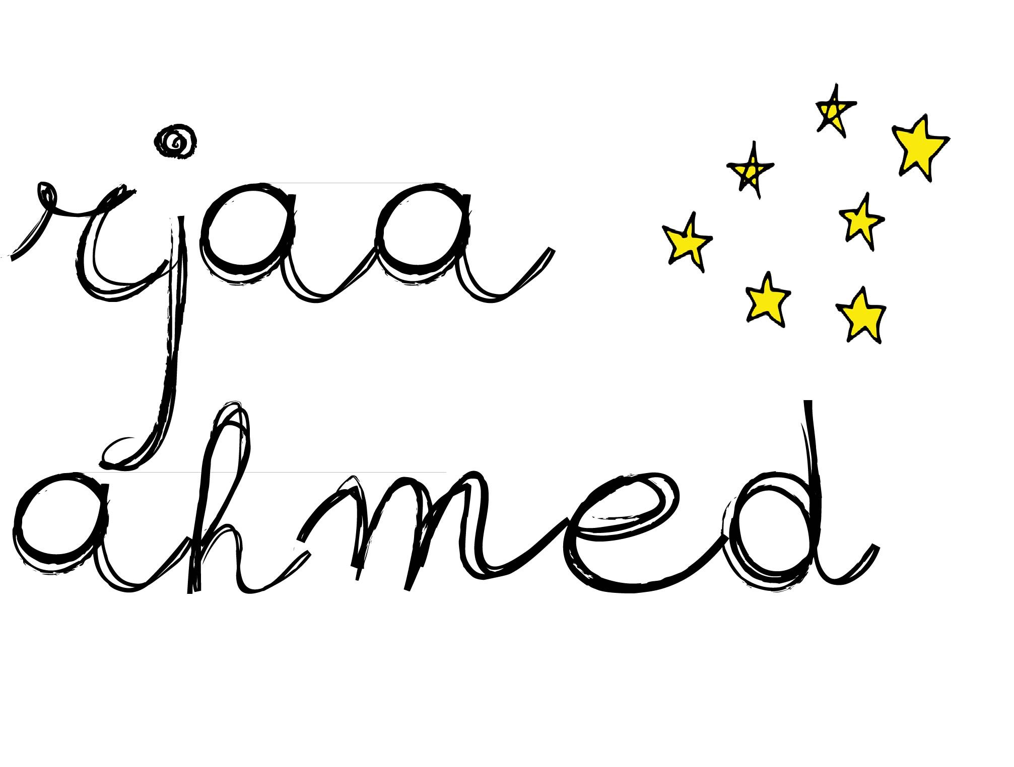
For my portfolio, I wanted a simplistic aesthetic that represents me while still being a little quirky and different. My favorite color is yellow so I incorporated it throughout the design and kept the rest of the color palette simple to make it pop. My logo has a hand-written font because I wanted to balance out simplicity with a little bit of uniqueness. Though the logo is just my name with some stars at the side, I wanted it to capture my personality and style. The stars add another pop of yellow while representing brightness and ambition.
In my “writings” page, I wanted to keep the columns’ design relatively straightforward. I added in yellow, gray and white overlays to the pictures to represent my color palette. For my “designs” page, I added in the yellow font to unify the color palette due to the presence of conflicting colors in my images. I played around with the layout a little and made some images larger than the others just to switch up the design and add some quirkiness. My homepage is also relatively simple and includes links to the writings and designs pages. I also added in a quote from Spongebob at the bottom, just to add in another tie into my personality. I wanted my portfolio site to be simple, clean and easy to navigate through while still adding some little touches to signify my personality.
