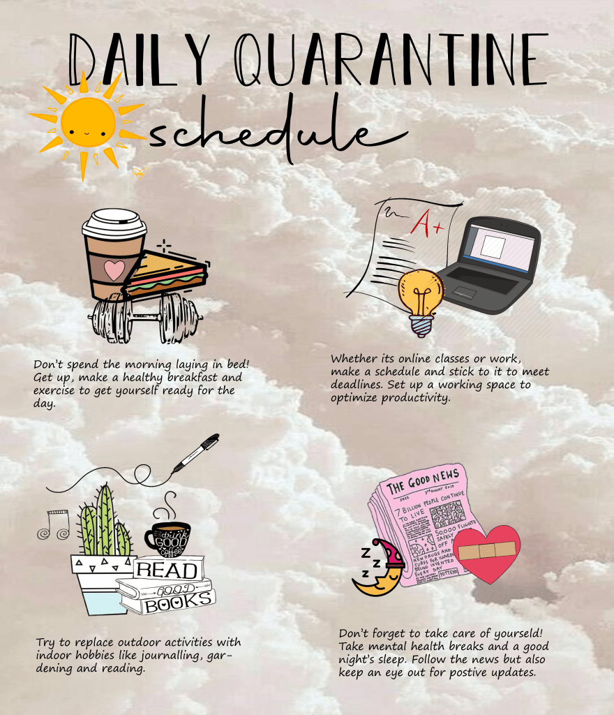
For my open project, I decided to do a social graphic. I strayed a little from my running Bon Appetit theme just because personally, being surrounded by so much COVID-19 related anxiety, I wasn’t feeling as inspired to create a food-related graphic. Instead, I decided to incorporate all the COVID-19 information and quarantine tips I’ve seen in blogs and on social media to create a suggested daily schedule.
I kept my background super simple so that it wouldn’t detract from the overall graphic. However, I made it pastel pink and cloudy to introduce a sense of calmness as light, airy colors are known to be stress-relievers. I also added a yellow sun up top because I wanted the color yellow, another tone that signifies happiness, to be the tying factor in my design. Yellow is spread over throughout and just to bring it all together, I added a bright yellow sun to introduce coherence. The rest of my design was quite simple – I wanted a flowy, easy to read font with pictures that looked like sketches to add a quirk factor. I used this article by UNICEF Serbia to draw inspiration but switched it up a little to make my design more suitable and attractive for young professionals.