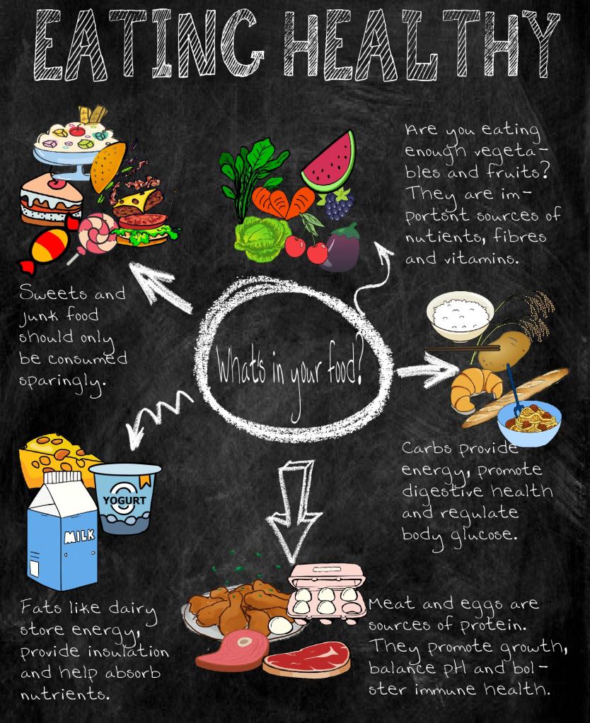
For my social graphic, I chose to run with my ongoing Bon Appetit theme. Bon Appetit is a food magazine so I created a graphic that represented it. I used a black and white background because Bon Appetit’s design is very straightforward and simple. I wanted to expand on my information graphic topic of food anatomy by making a graphic of the general food groups. Since it is a more information-heavy graphic, I wanted to offset the blocks of words with colorful food pictures to create a balance. I also went with a chalkboard theme because I wanted my graphic to emulate a learning environment. I also wanted to make it slightly quirky by adding the various arrows and using a font that looks handwritten.
Green, yellow and red are the predominant primary colors I used in the graphic because they closely represent natural food colors. Choosing and finding pictures was once again a challenge because I didn’t want realistic-looking images. To go with the raw, chalkboard theme, I wanted images that looked hand-drawn and hand-painted. I also wanted to keep the overall design simple to make these images and the information pop. Adding all the various colors over a gray-black background, in my opinion, makes the text blocks on the sides pop more.